CSS Cubic Bezier Generator
Create smooth, custom easing functions for your CSS animations with precision and ease
animation-timing-function: cubic-bezier(0.25, 0.1, 0.25, 1);
animation-duration: 1s;What is the CSS Cubic Bezier Generator?
Think of the CSS Cubic Bezier Generator as a remote control for the laws of physics in your web browser. In the world of web design, animations often feel robotic when they move at a constant speed. This tool allows you to act as a "motion architect," defining exactly how an element accelerates and decelerates over time.
By manipulating a mathematical curve, you can create animations that feel organic—like a bouncing ball, a swinging door, or a smooth sliding menu. Whether you are a beginner looking for classic "ease-in-out" presets or a pro crafting high-performance UI transitions, this generator provides the visual precision needed to bring your digital elements to life.
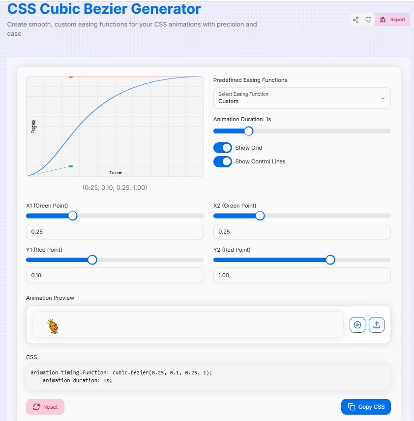
How to Use the Cubic Bezier Generator?
- 1Shape the Curve:
Start by selecting a preset easing function or directly drag the control points on the graph to sculpt your custom motion path.
- 2Fine-Tune Details:Coordinates & Duration:Manually input precise X and Y values or adjust the Animation Duration slider to control the timing.
- 3Test the Motion:
Watch the live preview box to see your curve in action. Toggle Grid Lines for accuracy or upload a Custom Image to see how your specific UI element will behave.
- 4Export & Implement:
Once the motion feels perfect, copy the generated `cubic-bezier()` CSS code and paste it directly into your `transition` or `animation` property.
Key Features for Perfect Motion
Pro Tips
"Bouncy" Effects
You can drag control points above 1.0 or below 0.0 to create "anticipation" or "overshoot" (bounce) effects.
Consistency
Use similar bezier curves across your entire site to create a cohesive brand "feeling" in your UI motion.
Duration Matters
A great curve can feel "off" if the duration is too long. Aim for 200ms–500ms for standard UI transitions.
Ready to master the art of motion? Start experimenting with the curve, watch how the speed changes, and create animations that your users will truly enjoy interacting with!
More CSS Tools
CSS Box Shadow Generator
Create and customize complex CSS box shadows with precision and ease.
CSS Flexbox Generator
Create, visualize, and customize flexible layouts using CSS Flexbox with precision and ease.
CSS Clip Path Generator
Create custom CSS shapes instantly with our free visual Clip Path Generator.
CSS Background Pattern Generator
Create beautiful CSS background patterns with our interactive generator.
CSS Gradient Generator
Create beautiful, customizable gradients using CSS with advanced options and features.
CSS Loader Generator
Create customizable CSS loaders for your web projects.