CSS Border Radius Generator
Create visually appealing and modern UI elements by customizing the corner radii and border properties of boxes
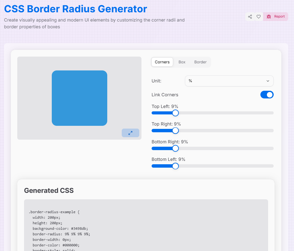
Generated CSS
What is the Enhanced Border Radius Generator?
Think of the Enhanced Border Radius Generator as a digital sculpting tool for your UI components. In modern web design, the difference between a "standard" look and a "premium" feel often lies in the curves. This tool allows you to move beyond simple rounded squares to create organic, fluid shapes that define the character of your interface.
By providing granular control over every single corner, this generator bridges the gap between basic CSS and advanced "blob" or "pill" designs. Whether you are crafting a perfect circle for a profile image or a complex asymmetric card, you can visualize the results in real-time and export production-ready code instantly.
How to Use the Border Radius Generator?
- 1Sculpt Your Corners:
Use the Corners tab to adjust each radius individually. Toggle the Link () icon to sync all corners at once, or Unlink () for asymmetric designs.
- 2Customize the Box:Dimensions & Background:Switch to the Box tab to modify the element's width, height, and color to match your design theme.
- 3Add Borders:
In the Border tab, adjust the stroke width, choose a style (Solid, Dashed, Dotted), and pick a color to outline your newly curved shape.
- 4Export & Implement:
Watch your changes in Fullscreen () and then copy the generated CSS or download the file to drop it straight into your code.
Key Features for Modern UI
Pro Tips
The "Circle" Hack
To create a perfect circle or pill shape, set your border-radius to 50% or a very large px value (e.g., 999px).
Blob Shapes
Unlink the corners and use different percentages for each to create "organic blobs," a popular trend in modern landing pages.
Consistency
Use rem or em units if you want your corners to scale proportionally with the user's font size settings.
Ready to elevate your designs? Start experimenting with the sliders, explore asymmetric curves, and see how much personality a simple border radius can add to your next web project!
More CSS Tools
CSS Glassmorphism Generator
Create stunning glass-like UI elements with advanced customization options.
CSS Background Pattern Generator
Create beautiful CSS background patterns with our interactive generator.
CSS Box Shadow Generator
Create and customize complex CSS box shadows with precision and ease.
CSS Clip Path Generator
Create custom CSS shapes instantly with our free visual Clip Path Generator.
CSS Cubic Bezier Generator
Create smooth, custom easing functions for your CSS animations with precision and ease.
CSS Flexbox Generator
Create, visualize, and customize flexible layouts using CSS Flexbox with precision and ease.