Color Wheel
Explore color theory and generate harmonious palettes with our advanced color wheel tool
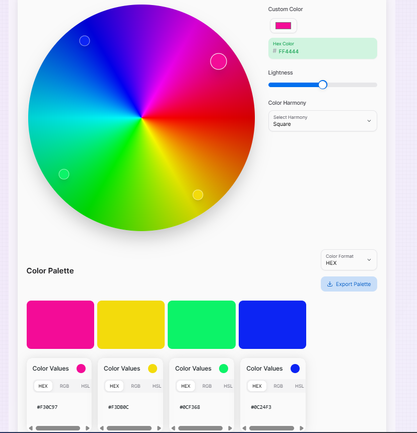
Color Palette
What is the Color Wheel?
The Color Wheel is a foundational instrument for any creative workflow. It is an advanced mathematical visualization of color theory, designed to help designers, developers, and artists discover perfect color harmonies and understand the complex relationships between different shades with surgical precision.
Whether you are building a professional brand identity, a user-friendly web interface, or a digital illustration, this tool offers an intuitive way to explore color spaces. By interacting with the wheel, you can instantly generate sophisticated palettes—from bold triadic schemes to subtle monochromatic themes—bridging the gap between raw inspiration and scientific harmony.
How to Use the Color Wheel?
- 1Select Base Color:
Click or drag within the Interactive Wheel to pick your core color. Alternatively, use the custom input field to enter a specific HEX, RGB, or HSL value.
- 2Choose Harmony Mode:
Select a Harmony Type (Complementary, Analogous, Triadic, etc.). The tool will automatically calculate and display the matching colors based on color theory.
- 3Refine Lightness:
Use the Lightness slider to modify the overall brightness of your palette. You can also click any generated color to set it as the new primary base.
- 4Export Palette:
Use the Copy buttons to grab individual values, or click Download to save your entire harmonious palette as a PNG image for your records.
Key Features for Professionals
Pro Tips for Color Mastery
Contrast Focus
Always test your wheel-generated colors for text legibility. Ensure the contrast ratio between your primary and secondary colors meets WCAG standards.
Monochromatic
For a professional and "clean" UI, use Monochromatic harmony. It creates depth without overwhelming the user with too many colors.
Brand Sync
Input your core brand HEX first, then explore Analogous harmonies to find the perfect accent colors for icons and borders.
Workflow Integration
CSS Variables
Export your wheel harmonies directly into CSS variables or Tailwind configs for consistent theme management.
Graphic Design
Import your PNG palettes into Adobe Suite or Figma to ensure print and digital assets share the same scientific harmony.
Style Guides
Use the wheel to build internal design systems that provide primary, secondary, and tertiary color rules for your organization.
The Color Wheel is more than just a tool—it's a playground for creative exploration. By combining mathematical precision with visual intuition, you can build cohesive color systems that elevate your digital projects. Start exploring harmonies and bring your vision to life today!
More Color Tools
AI Color Palette Generator
Create the perfect color scheme with AI assistance.
Color Mixer
Mix colors, generate shades, and explore different color formats with advanced features.
Color Name Generator
Explore color theory and generate harmonious palettes with our advanced color wheel tool.
Image Color Extractor
Effortlessly extract dominant colors from images and create stunning color palettes for your projects.
Image Color Picker
Extract HEX, RGB, and HSL color codes from any image instantly. Upload and pick precise pixel colors online for web design and UI development.
Color Converter
Convert colors between HEX, RGB, HSL, HSV, and RGBA formats with advanced features.